
Aloharmony Artists’
Harmonizing The Body And Mind Through Sound
My Role: Project Manager
Client: Aloharmony
Duration: 3 Weeks
UX Research & UI Visual Design
Team: 3 Designers & 4 Developers

Project Overview
Sound, Video, Meditation, and Movement
Aloharmony provides a platform for its users to take sanctuary in media. With growing numbers of people dealing with stress and anxiety, many turn to music to help clear their mind. Aloharmony - originally named Aloha - is a mobile app that gives users a catalogue of music to help simulate the feeling of calm and peace within their brain.
The Artist And The Mind
With the competitive nature of content creation and music sharing online - artists, primarily music artists, are forced to market their work on platforms that don’t prioritize their specialties. Aloharmony Artists aims to build a platform for wellness artists to post and monetize their content on a curated application for users looking for wellness-specific music.
-
A dashboard for artists to view metrics, financial updates, and upload content through the Aloharmony platform. The prototype is designed to be utilized on a desktop.
-
Figma,
Adobe Photoshop,
Adobe Illustrator,
Zeplin

The Challenge
Currently, Aloharmony does not have a personalized account system solely for artists. The outreach, distribution, and publishing of content within Aloharmony's platform is done internally. This limits the amount of artists that are currently working with the platform, while also adding work on the internal team that could be avoided.


Asking Ourselves…

The Solution
The highest priority for Aloharmony Artists is to provide a creator-facing platform within their own internal systems. This allows for outside artists to register to distribute within Aloharmony, creating a relationship between the internal team, the artist, and the Aloharmony user-base.
Features


Global visualization of finances and content performance
Messaging inbox between Artists, Internal Staff, and Fans
Freedom to cash out earnings at any moment desired
Real time metrics and detailed content analytics breakdown

The Design Process


Where Does Aloharmony Stand?
The Business Approach
There were subjects that we as a design team needed to understand in order to approach who the Aloharmony Artist is. Taking a look at their existing application, we knew Aloharmony emphasizes music for wellness. This included sound waves, ASMR, and therapeutic music.
How Does Aloharmony Present Their Content?



As Aloharmony only distributes their music internally, they aim to target artists who specialize on these specific categories.

The Current Market
Aloharmony currently does not stand as the only wellness music platform within the global internet. Our research team conducted a competitive and comparative feature analysis, in order to gain a full understanding of what is currently being offered in the music/content creation industry, and how does Aloharmony differentiate from its direct (and indirect) competitors.
The Competitors


The Comparators


What Are Artists Saying?
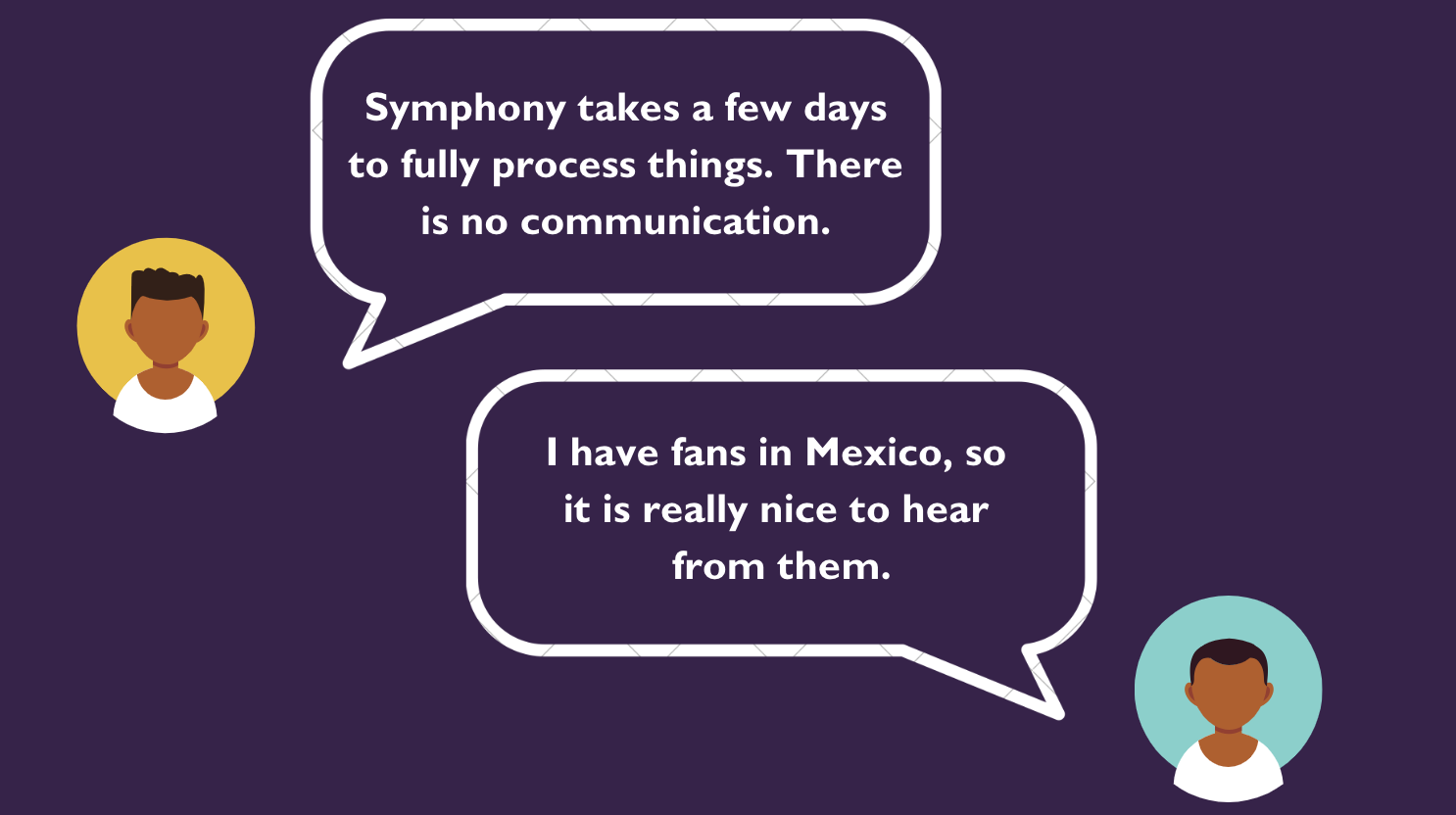
Conducting User Interviews is one of the most crucial aspects into our team’s research when understanding Aloharmony's user base, along with the artists' perspective of content creation. Our team divided the conversations between artists that are familiar with Aloharmony, create wellness centered music, and artists who create general music or media entertainment for online viewing.
What Does This Mean?

Taking notable quotes and repetitive talking points, I wanted to scribe what each of these quotes mean on the grander scheme. What are artists looking for when it comes to ease of content creation? What are their current experiences with the platforms they use? This information can help our team implement new design systems for Aloharmony’s new application.
Synthesizing
Some Trends We’re Noticing…

Artists Want…
…to interact with their audience members
…to be more involved with the details of their content distribution
…to know where their fans are listening from around the world
…to share their music through multiple social media platforms
…to control when their content is being uploaded and where it is being filtered
Who Is The Aloharmony Artist?
Our design team gathered all of our research and humanized our target audience. This is Sofia, the perfect candidate looking for a platform that will host her music and take her brand to the next level.

Age: 34
Goals
Sofia
Needs
A platform thats consistent to her type of content - wellness and health
To see real time metrics of her content's performance at any moment
Seamless communication with her platform’s internal staff
Uniformed platform that allows ownership of her contents statistics
-
Sofia’s Wants / Needs
A platform that caters to wellness and health
Easy accessibility to her real-time metrics on account performance
A system of communication between herself, her managers, and the platforms internal team
Full control of her content’s information, without needing to rely on outside sources
Opportunities
Aloharmony is focused on wellness and health content through music
Real time access to individual statistics around the world
A unique chat/messaging system between artist and internal staff
The artist owns the main account - their accessibility is at the forefront
Status: Married
Job: Musician
Sofia is a lover of nature, the body, and the mind. She prioritizes her health for not only herself, but her clients. She spends most of her days in her studio, creating songs and melody that soothes her mind.
To be able to distribute her music with a wider audience
To see how well her music is performing
To be as involved with her distributors as she possibly can
To gain control of her account’s content, data, and finances
Frustrations
Feeling she is overshadowed by popular content creators
The lack of transparency in delivering performance data
It's hard to get detailed information on how her music is being used
Forced to contact third party for content information
How Will Creators Utilize Aloharmony Artists?
Sketching Our Thoughts
At the start of designing Aloharmony Artists’ interface, we as designers made quick sketches of our vision - including the features we believed that were necessary. Following this session, we came together to discuss and critique each sketch, taking those critiques into account for a second round of sketching. During the final round, our team produced a single design that incorporated all agreed-upon features.

Digitalizing Our Vision
After reviewing the sketches produced during the Design Lab, our team proceeded to digitize our designs using Figma as our primary platform. We focused on incorporating the most crucial features into our prototype, that included creating an account and uploading content, a view on global metrics, cashing out and checking urgent messages.

Finalizaing
Aloharmony Artists
Further testing and research analysis, it was evident that the Prototype required modifications, as the initial draft could not be considered perfect. The changes implemented took into account the observed behaviors of users during the first round of testing. As part of this project, the updates also entailed transforming the prototype into a High-Fidelity Prototype.
Changes Into Design
User Testing
While testing our mid-fidelity prototype, our users had successfully reached the end of the tasks, however, there were several flaws that were highlighted while navigating our prototype.
Task 1: Account Creation
Problem:
Users have stated that the registration process felt fairly overwhelming.
Users have started the final page looks underwhelming and blown out of proportion.
Task 2: Cashing Out
Solution:
Adding a timed prompt that sections off parts of the registration process.
The final page has a more organized layout with clear instructions.
Problem:
Users have stated the finances do not display all the information that is important to them.
The “Cash Out” button wasn’t clear enough, and felt very minimal compared to the other features/information on the page.
Task 3: Global Performance
Problem:
Users have stated the visualization of the globe was not large enough - it was difficult to take in the information.
The page itself felt very blank. Users want more information regarding their global metrics.
Task 4: Artist Inbox
Solution:
Establish a hierarchy of what information is crucial for artists trying to understand their financial breakdown.
Make the “Cash Out” page more clear, and restructure the page, putting the wallet at the forefront.
Solution:
Enlarge the globe. The visuals should be clear about what information is being shared.
Displaying a short graphic of a breakdown of statistics. This would then allow for artists to gather a full understanding of how they’re doing throughout the world.
Problem:
Users stated the urgency notification was not noticeable at all when browsing messages.
Users have started the messages page look fairly bland, and there should be a more obvious indicator as to which message have been read or not.
Solution:
Redesigning the icons of the “urgent” messages so that they are more clear and larger.
A label that indicates which messages have been read or not. Additionally, there should be a level of type weight that indicates the read/unread messages.
What We’ve Learned
Specifics with Metrics
Artists have stated the specifics of their analytics was highly favorable.
Artists have stated they liked the hierarchy of the dashboard, but stated the buttons should be consistent.
Registration Process
Artists have felt generally positive about the timed tutorial.
Artists have stated the hierarchy of the registration process should move around a bit.
Improved Finances
Artists have stated their desire for a bigger breakdown of finances - similar to “My Metrics”
Artists have stated the QR code is small, and a little distracting.
Artist Referrals
Artists have stated their desire to have a communication system within messaging between their management team.
Artists have stated the importance of accessibility of their management team - especially with performance metrics.
Aloharmony Artists’ To Be Launched Soon
As Aloharmony Artists moves to launch within Summer of 2023, our team gathered a few notes that we brought to the Aloharmony team that should be implemented on future updates.
Tutorial
Cashing Out
As a team, there were several insights that were given after the hi-fidelity prototype. The biggest takeaway was the registration process. Many have stated that the process was fairly overwhelming. New users are immediately thrown onto the registration process, without any prior knowledge on what to expect. We believe designing a quick tutorial would be crucial. This way, users are able to follow in an organized manner.
Many have stated differentiating opinions on the layout of the finances page. Some stated the overall wallet being the most important feature on the page, while others have stated the hierarchy of information was fine as is. For this, we believe more testing, especially within the artists in the music/content creation field would be crucial.
Permissions
Throughout the research process, artists have emphasized the importance of communications between their managers, producers, and overall third party staff. We believe that within Aloharmony Artists', the artist should be at the forefront of the account - however the artist can give permissions for all producers/managers who work with them. The artist can control what the outside third party user can see, and therefore communications between the team would be simple.
What I’ve Learned


Taking into account the third party-users when designing business platforms, especially for small business creators.
Dashboards can be limiting into displaying the specific sort of information.


Dashboards shouldn’t be completely overrun by graphs and visuals - don’t be afraid of showing numbers.
Information hierarchy can be defined based on personal preferences. There is no one “right” answer on layout.