Design Under 30 — 30 Day Rebrand Challenge
Brasserie Mémère
Role:
Project Manager
Lead UI Designer
Bringing Back French Cuisine with a Fresh Look
Team:
2 UI Designers
1 UX Researcher
Timeline:
30 Day Design Sprint
1 Year Post-Production Work
Welcoming an updated outlook to a famed French Brasserie Restaurant
Brasserie Mémère has been bringing in the French cuisine experience to Closter, New Jersey for over 8 years. The brick-and-mortar location has shared its unique corner of France. However, since 2020 the restaurant industry has made a complete change onto how it presents itself. COVID has forced many locations to close - and marketing has relied on the online world.
Brasserie Mémère moves online
How will the design team for Brasserie Mémère translate the vintage French aesthetic onto an online presence? Additionally, Brasserie Mémère’s target audience is above 50+ of age, therefore accessibility must be taken into account.

Brasserie Memere Has It’s People…But No Online Visibility
Brasserie Mémère has…
250+ Guests
Visiting daily at their restaurant via word of mouth
Refocusing Online
Post rebranded launch, I led the team for a focused online presence, targeted younger users and event space promotion.
As of 2020
40% Loss
In guest population with a 12% increase per year
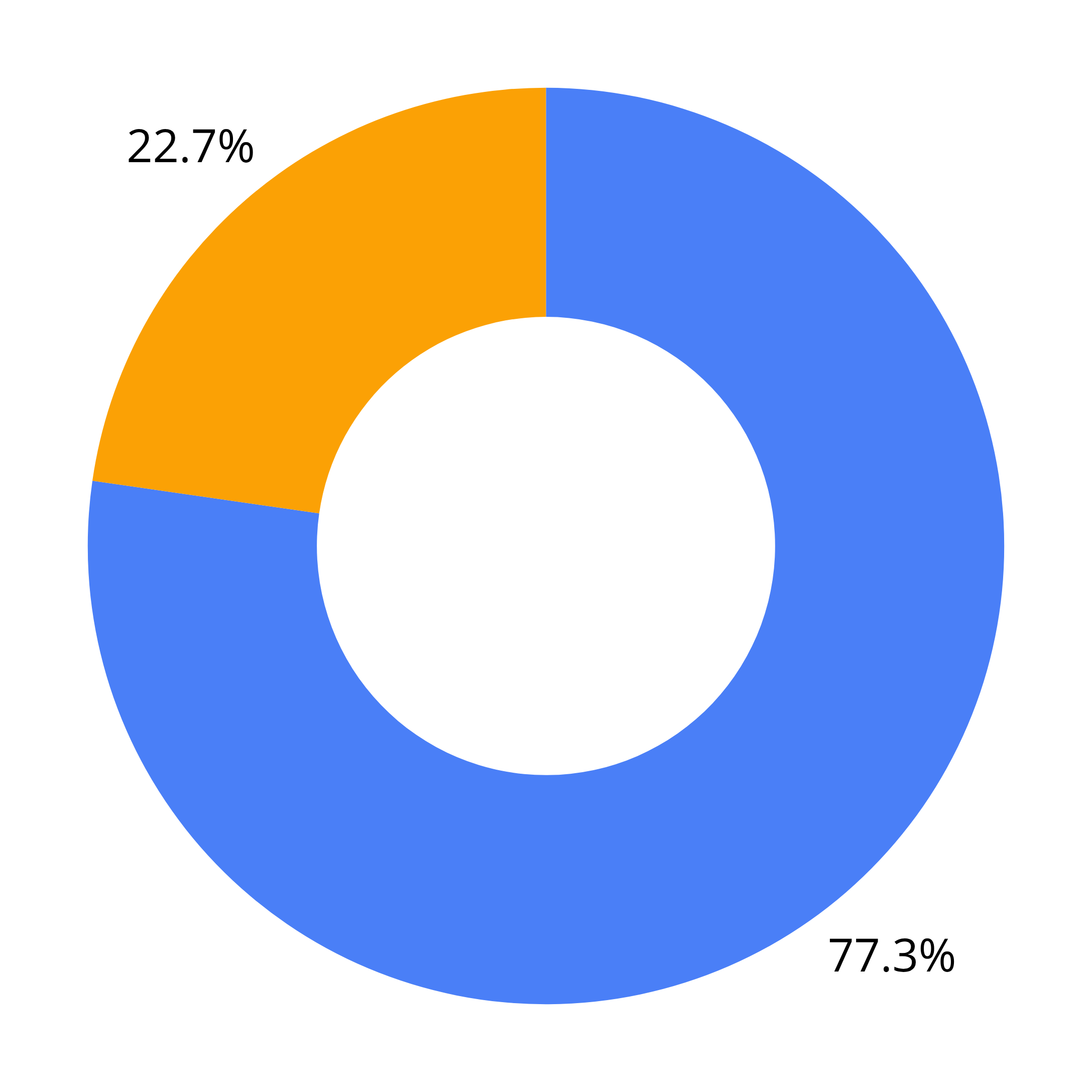
77%
Guests visit a restaurant’s website before they decide to dine or order online.
With a lack of an updated online presence, Brasserie Mémère is unable to expand to newer guests. Additionally, many state they are uninspired to go to the restaurant based on exploring their current website.
Events Make Up
48% Overall
Overall business earnings.
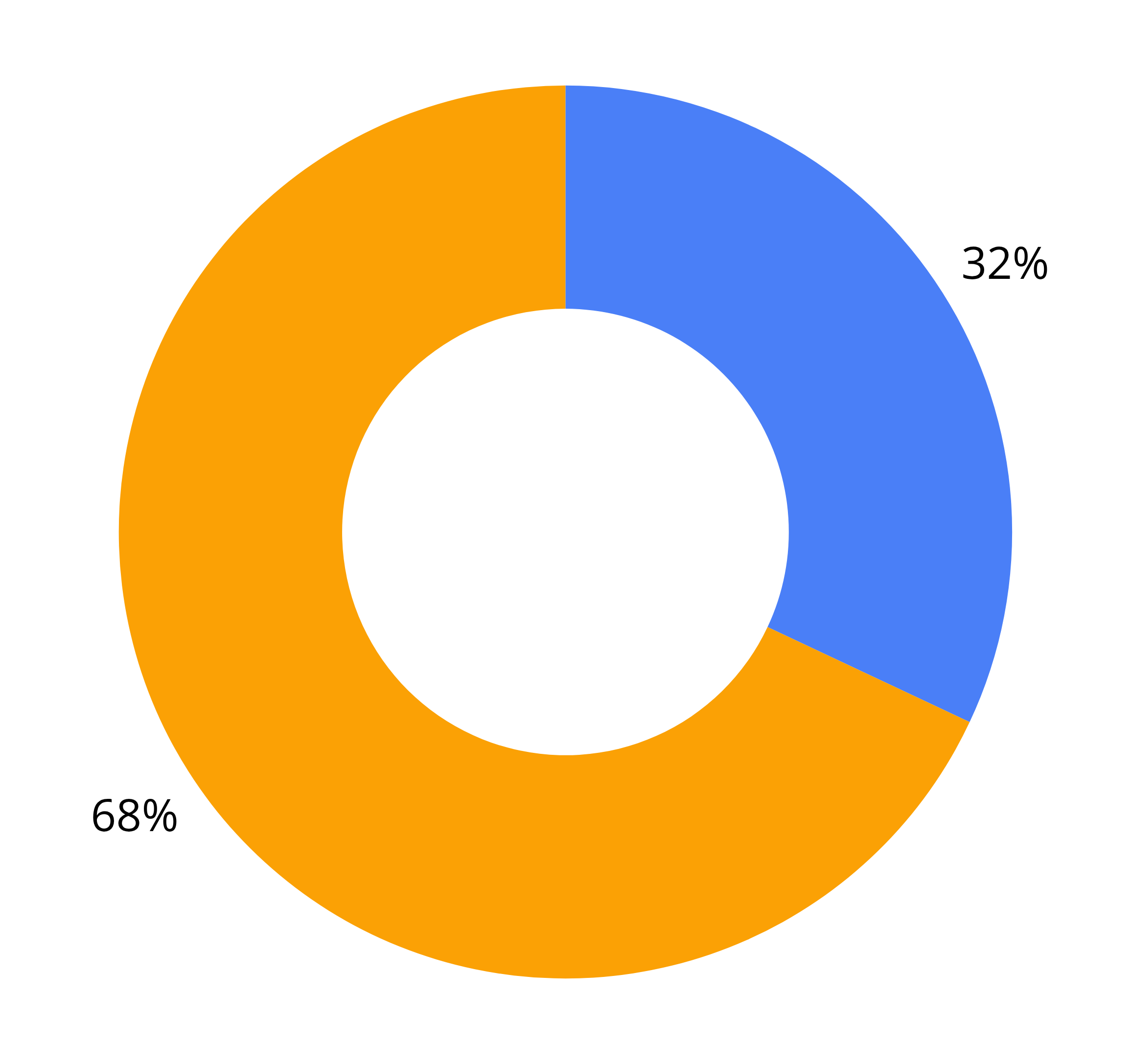
68%
Guests have found that they are discouraged from visiting a restaurant due to their website.
Data calculated by the MGH Restaurant Survey, 2019Implemented Solution
The design team and I created a new layout - displaying the unique vintage French experience online, while taking into account accessibility, current events, and modern restaurant industry trends for online platforms.
18%
Increase in booked events using the online portal within the first 6 months of launch.
01
03
A seamless main navigation that prioritizes the important aspects behind the restaurant.
04
Design systems that match WCAG 2.1 and ADA requirements.
Secondary navigational menu for dine-in menus - creating ease of interactivity.

A page for private and on-going events with a call to reserving through filling online forms.
02
85%
of guests stated a desire to reserve and visit the restaurant after browsing the menu and available weekly offerings
27%
Increase in customer interest in visiting restaurant during different times due to menu access.

22
out of
27
Were New Jersey Residents
While interviewing, there were a few notable points stated by restaurant guests. Some are listed below.
P6
“I typically go to restaurant’s websites to see what food they’re offering. Pictures help a lot if I don’t understand what I’m reading”
P12
“Sometimes you can tell if a restaurant is fancy or really simple. I’d rather learn from what the place looks like.”

7/10
Identified as Food Enthusiasts
P11
Who Did We Speak To?
Because Brasserie Mémère had a goal of expanding their guests, they wanted to learn from the perspective of younger crowds - even though and older guest was their priority.
I centered many of the questions around how guests find their restaurant outings. What do they search in preparation? What are key factors in deciding to dine somewhere?

90%
Are visiting to try French cuisine for the first time
Notable Findings
“I don’t like making calls - so if I’m forced to make a call for a large reservation I would make someone else do it.”
P19
“I find majority of my restaurants online - whether its through social media or searching through Google”
14
out of
27
Were Older Than 60 Yrs
Understanding Our Findings
In order to gather the themes of what was being said, we began mapping notable points and grouping them under repetitive ideas.


Guests want to visually take in the restaurant before dining
Guests want multiple methods of reserving private events
Guests enjoy when restaurants host large events or have seasonal items
Guests want a seamless online reservation systems
Key Findings
What Do Guests Want To See First?
When brainstorming the layout of the website, I suggested restructuring the main navigation. A new design system we implemented was a drop down menu - which would be utilized for Menu, Events, and Contact.

Our Priorities
01
02

Designing a Landing Page that allowed guests to navigate to multiple parts of the restaurant’s website.
Drafting a page for reserving private events and ongoing events within the restaurant.
03
Highlighting visuals of the restaurant and the food throughout the website, not just the Gallery.

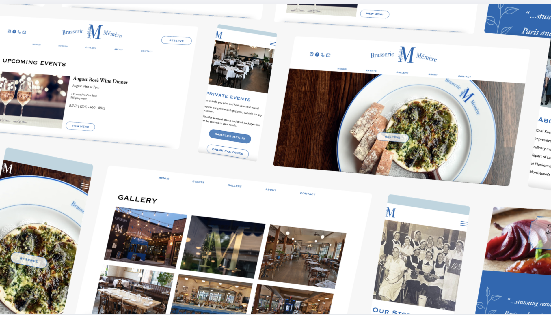
Taste Testing Designs
We moved to digitalizing our designs and testings to see what needed improvements. With feedback on our mid-fidelity designs came changes towards our high-fidelity mockups. The results and changes are shown below.
Menu Content Page

Mid-Fidelity Mockup Of Menus Page
Guests stated issues with the menu itself feeling too small and unaligned against visuals.
Guests questioned whether the Kids Menu was served on specific times.

Private Events Booking
Mid-Fidelity Mockup Of Private Events Page
Guests stated issues with scrolling to the bottom of the page to reach the inquiry form.
Guests called for more details regarding the event space - with more visuals.

High-Fidelity Mockup Of Private Events Page
We created a button for guests to jump immediately to the form - should they need to.
We added a gallery per each room, allowing guests to view the full event space.

On-Going Events
Mid-Fidelity Mockup Of On-Going Events Page
Guests questioned the reservation system for Upcoming Events.
Guests stated the overall page looking a little empty.

High-Fidelity Mockup Of Menus Page
The layout of the visuals were rearranged - allowing for more room for the menu items to be seen.
The Kids Menu was integrated onto all the Menu options

High-Fidelity Mockup Of On-Going Events Page
We added contact information for Upcoming Events RSVP.
We added ‘Weekly Deals’ onto the page to fill content.
Introducing
Brasserie Mémère
Explore a modern look to French Dining
Toggle between menus with ease
Utilize the secondary navigation menu to toggle between dining times. Guest can explore different food options based on what is available and during specific timezones. Each menu is complimented with stunning visuals of the offered meals.
27%
of users reported an increased satisfaction post launch in interacting with the menu items
Explore the new Book Private Events page, with a catalogue of visuals showcasing Brasserie Mémère’s spaces. Additionally, view and RSVP for upcoming events going within the restaurant.
85%
of guests have stated they wish to visit the restaurant
Book private events efficiently
Have a look at Brasserie Mémère’s stunning space
Explore the new Book Private Events page, with a catalogue of visuals showcasing Brasserie Mémère’s spaces. Additionally, view and RSVP for upcoming events going within the restaurant.
18%
immediate increase of booked events within the first 6 months of launch
Next Steps
Mobile Implementation
01

On the first round of testing, there was a 25% increase in ease of usability for viewing the menu and private events.
03
We have an established design for the mobile platform, however there needs to be more testing within the app.
02
Guests have stated a more organized private events page - with a better call to action for viewing different rooms.
More Accessibility Design
01
02
I have taken accessibility design into account when establishing a style guide. This is mostly prevalent with the font and visuals.
I wish to implement more design systems that are WCAg 2.1 and ADA compliant.
Bon Apètite!
Reflecting upon my work…
This was the first time I was exposed to accessibility design. I was responsible with understanding what changes we had to make when taking into account visuals and fonts for an older crowd. I spent a lot of my research looking into WCAG 2.1 and ADA requirements, and communicated this with both the design team and Brasserie Mémère staff. This project was extremely enlightening towards learning how to become a better accessible designer. I have learned about how many elderly users are not considered when designing and developing digital products.
Mostly design decisions on the mobile end. I believe there are improvements to be made within Brasserie Mémère’s mobile platform. I would spend more time researching restaurant mobile designs. Our team spent a few hours taking a look into competitors mobile websites - but what we found is that it is an easily neglected part of a restaurant’s online presence. I firmly believe Brasserie Mémère should take advantage of an overlooked market, as 90% of guests have stated they primarily use their phone to search about restaurants.
What I would change…